Summer Project 2015
Mediums: Watercolor, Acrylic, Ink, Charcoal
June-August 2015.
Exhibition Text: All of these works were inspired by either a specific artist work like Pablo Picasso's "The Old Guitarist," Andy Warhol's "Red Liz," and Henri Matisse's portraiture, a clothed model, or a still life. In the summer, I tried to experiment with different mediums to get a feel for what I liked best. I attempted using watercolor, acrylic, charcoal, and ink.
|
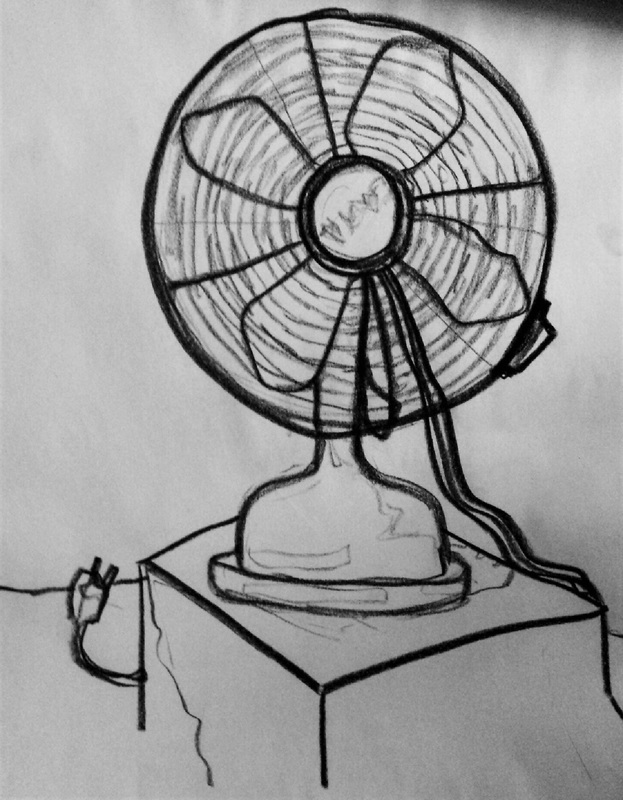
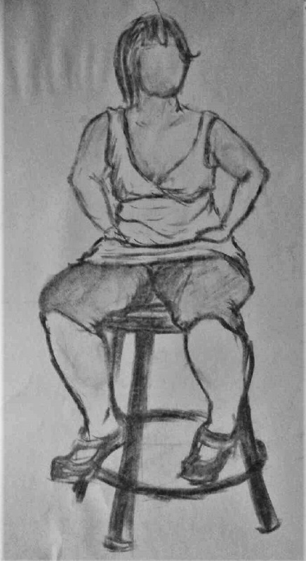
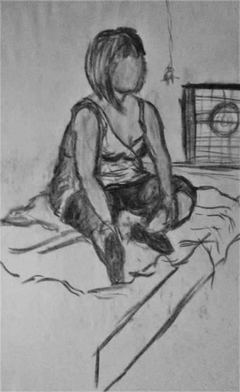
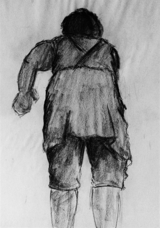
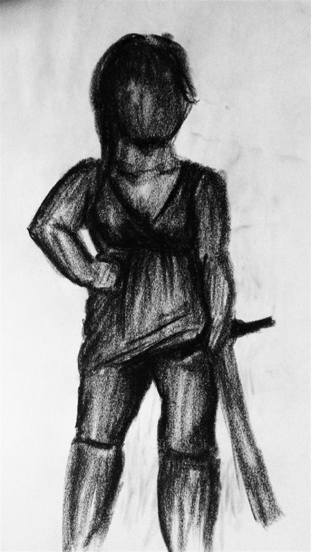
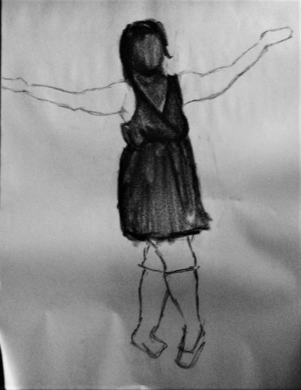
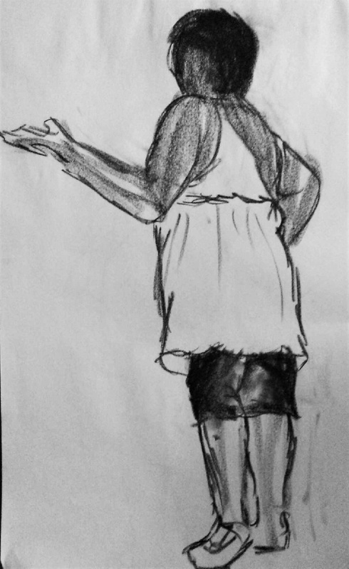
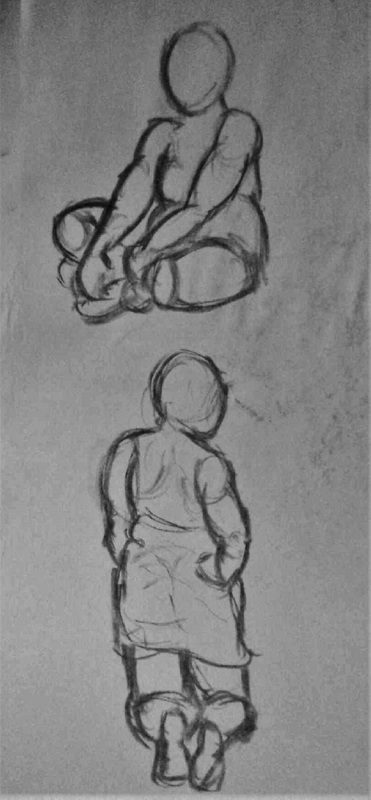
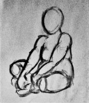
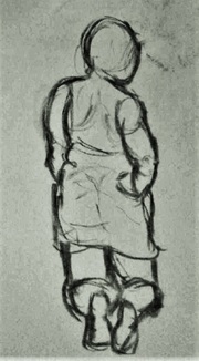
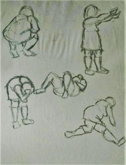
Over the summer, I had the opportunity to draw from life using a clothed model. I challenged myself, beginning with quick sketches at first, then began to allow myself more time to complete the drawings. For all of the still life pieces, I used charcoal because I was able to shade rapidly and blend easily. Some of the drawings are not completely proportionate, but I tried to develop the basic forms and shapes that I noticed on the model so I could demonstrate her gesture through my work. Before using shading, I sketched out the lines that made up the figure's body.
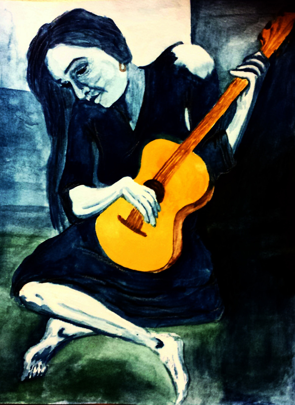
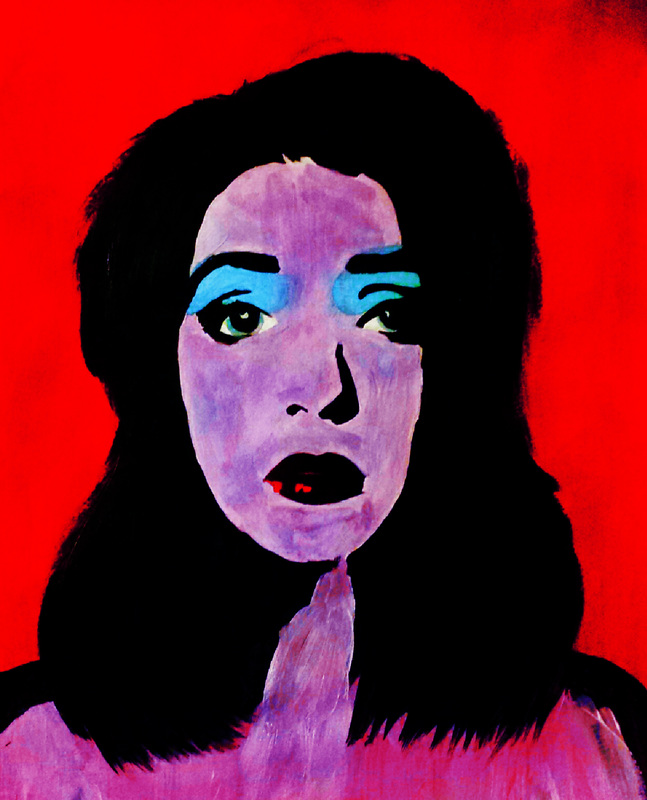
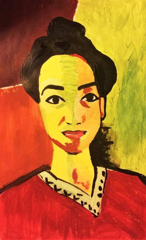
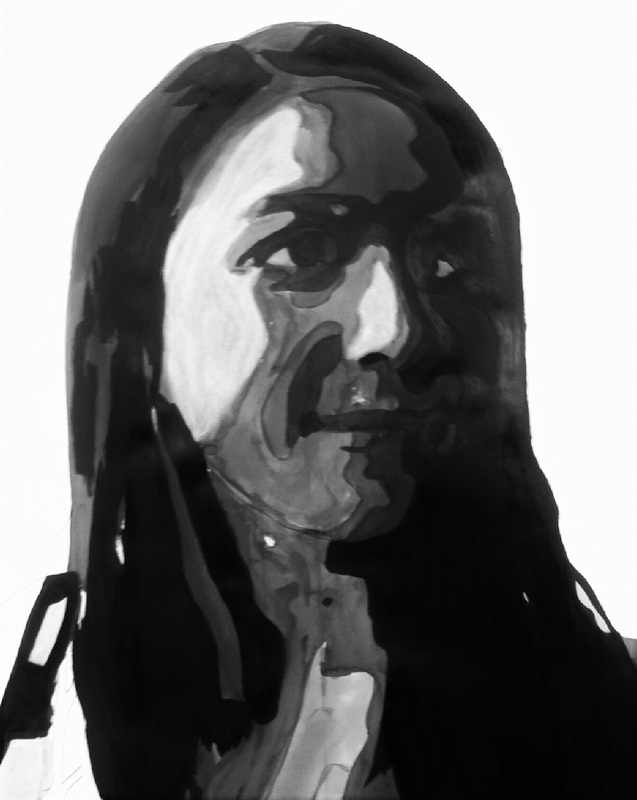
After the clothed model, I wanted to begin trying to emulate the styles of famous artists. I rarely used color in my pieces, so I wanted to move out of my comfort zone by putting an image of myself in my version of Picasso's "The Old Guitarist." For this piece, I used watercolor as my medium because I had never really used it before and I wanted to see how well I could manipulate the medium. It was really difficult to get the tones I wanted at first because at times, I would add too much water or too little. The background was the most frustrating part because there was so much blue. The tones never seemed to come out to be the same tones, but I think I like the grainy look of the piece. My favorite part is the strokes in the arm because it contrasts nicely with the white tones. Once I realized how time consuming using watercolors was, I decided to return to acrylics. I found my inspiration in Andy Warhol's pop art pieces, specifically "Red Liz." I wanted to use a similar color palette because I appreciated his use of red against the bright blue and lavender. I struggled to get the right purple tone. I think I might go back in to the painting to rework the purple tones in the face to be more opaque so it goes along with the rest of the opacity of the other colors in the piece. The last artist I was inspired by was Matisse. This was by far the most difficult piece to create. I think the brushstrokes were the most challenging because they were long and straight, but were placed so intelligently that it was a difficult style to replicate. I am determined to create another piece of Matisse's at some point because I want to master his style. I attempted to create the tones that Matisse used in his pieces, but I believe my main success was in the sketch rather than in the final product. I do think the shirt on the figure is a good representation of Matisse's style, so I think in that aspect I succeeded. |
