Pieces of Me
Graphite on paper
August 2015
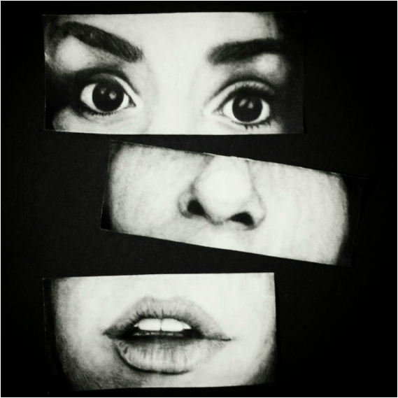
This piece was inspired by a young, aspiring artist who attended the summer art classes at MIAD. The moment I saw her work, I immediately felt a connection because I understood the chaos and brokenness that she attempted to convey through her sketches. The theme that began to emerge from my piece was identity. In this piece, I wanted to capture the essence of different aspects of who I am as a person. People can get to know my true self through what I have witnessed and experienced, through my flaws, and lastly, through my words. I have learned to be very careful with what I speak aloud because words can have a very prominent effect on others. All of these pieces of me made me a stronger individual which allowed me to examine other parts of my life that were not as happy as they are now.
|
For this piece, I wanted to explore more of my identity through three different lenses: the events I have experienced or witnessed, flaws that I have grown to embrace, and the words that motivate me to reach my ultimate goals.
My inspirations for this piece include the theme of identity and a young, talented artist who attended the summer classes at Milwaukee Institute of Art and Design. As I walked through the halls of MIAD, I noticed her piece. It was much more chaotic than mine and had her face sketched on multiple times, simulating a three-headed monster of some sort. Her medium was charcoal, but I decided to use graphite on paper to achieve a result that was less messy. The eyes are known as the "windows to the soul" so the meaning behind the eyes included some of the major events that occurred in my life over the past two years. I witnessed the divorce of my parents, and though I was unsure of what exactly was occurring at the time, I understand that my parents were happier apart. So this experience allowed me to become more patient and understanding with people, rather than immediately jumping to conclusions when someone is acting unnaturally. I have experienced harassment and the death of a loved one. Both of these events shaped me into a person who can handle pain, but still express grief. The nose represents the flaws that I now embrace. I used to hate my nose because I thought it was too round, too big, and too long. I would be so worried about how I looked and how others perceived me to be that I began to forget about the beautiful qualities I have. So I started to embrace my flaws to turn them into something beautiful. I no longer cared that I was not as thin as the girls on the magazines. I did not mind that my nose was not petite or perfectly straight. I did not care if I looked like more of a Caucasian than a Mexican. I simply embraced it. The mouth focused on the words that motivate me to reach my goals. People always tell me that I am going to be successful. So I think maybe that is what pushed me to begin thinking about a career in healthcare, because what can be considered more successful than a doctor, right? The truth is, I do not know. But this unknown is what is motivating me to continue on. I am aware that time is flying, but my goals are still intact. Graduate high school. Go on to college. Get a degree. Get married. Have children. Be happy. All of these things are pieces of me that make me who I am. For the process of this piece, I used the grid method to ensure that all of the features were proportionate. Then I began to work my way from the highlights to the shadows to create a great depth with the piece. The graphite did get a bit difficult to work with at some points, especially with the nose because there was less gradation because there were not as many harsh lines. So I had to try to create a form that was relatively close to the shape of my nose by using softer lines to create the three-dimensional effect. Once the graphite portion of the piece was completed, I tilted each facial feature slightly and spread them out to show the brokenness between the features, but still made it possible to distinguish the whole face of the figure. All of the parts were sealed onto a black board to add the final finish to the piece. |
|
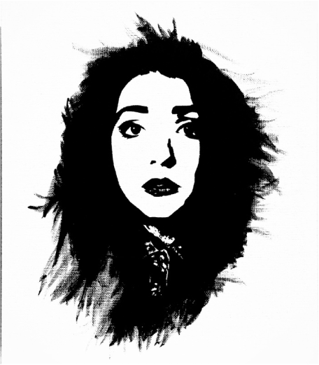
Depression
Acrylic on canvas
September 2015
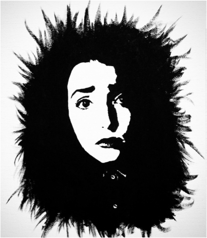
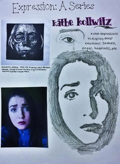
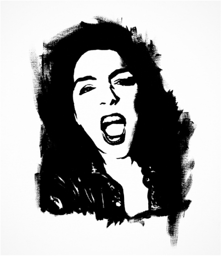
This piece is a part of a triptych for an expression series. It was titled Depression because of the facial expression showing a deep sadness and the use of a dark black tone. Though the piece originally was inspired by Kathe Kollwitz, a German Expressionist artist, for her great talent of highlighting an emotion in her work, it began to resemble a pop art piece because of the precise outlining of facial features to show a lot of detail but minimal depth. To show the effects of depression, the black acrylic paint that was used for the facial features was painted on carelessly with the brush to show that emotions can make someone wild. It can evoke a feeling of deep sadness that spreads onto surroundings like other family members or friends.
|
The main theme that I intended to capture with this expression series is identity. A lot of teenagers struggle with very strong emotions that may sometimes become uncontrollable if they do not receive proper help. So my pieces explore these emotions and show that they are not just black and white. There are a lot of gray areas that provide reasoning for these emotions that may not always be clear to the people who are either feeling these emotions or are witnessing them.
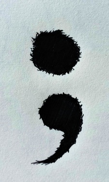
Depression is a large issue throughout the world that can lead to negative outcomes such as experimentation with sex, drugs or alcohol, a loss of interest in activities that the affected people were previously interested in, and suicide. Statistics show that depression is the most common mental health disorder among teenagers and adults, with 20 percent of teenagers being affected by the disorder. Depression is normally set off by a crisis in life such as the burdens of death, divorce, domestic violence, abuse, or excessive arguing. When depression deepens, it can lead to teenagers seriously considering an attempt at suicide. One in every twelve teenagers who are affected by depression attempt suicide. Females generally tend to attempt suicide more often than males, but males are five times more successful. Unfortunately, suicide happens to be the third leading cause of death in young people ages 15 to 24, so this is a huge issue that needs to be addressed. People in the community have created movements such as the semicolon movement to emphasize that a person's life does not need to end because of depression. People are encouraged to draw a semicolon on their wrist to show those who are depressed that society cares and wants to help them defeat the sadness. The message that goes along with this movement is, "A semicolon represents a sentence the author could've ended, but chose not to. The author is you and the sentence is your life. Your story isn't over yet." This movement gives people hope and motivates them to push past the obstacles to experience the happiness they truly deserve. For all of these reasons, I decided to create my piece which I titled, "Depression." The painting depicts my face displaying a deeply sad expression in a pop art style with a German Expressionist feel to it. To make sure that I had the correct proportions, I used the grid method to create my face on the canvas before I began painting with my medium: acrylic. I chose acrylic paint because I wanted to experiment with it a bit more. I also thought it would give me the opaque tones that I needed for the black to stand out in the painting. The color palette I chose was black and white because I felt that colors would be too distracting and take away the emotions that I desired to evoke in the audience. Instead of creating the hair all perfectly laid on my shoulders, I used wild brushstrokes to simulate the effect that depression can have on some people. Depression is a disorder that tends to spread onto its surroundings. If the people who surround me are negative, the chances of me developing a negative attitude are higher than if they were not negative. This works in a similar fashion for positivity, which is why people who are depressed need to be surrounded by positive influences rather than people who remind them of their supposed "worthlessness." |
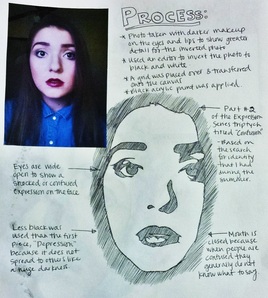
Confusion
Acrylic on canvas
October 2015
This piece is the second part of the expression series triptych. It was also inspired by Kathe Kollwitz, though it resembles pop art work with the subtraction of color. Along with depression, this piece displays the confusion a lot of teenagers feel at this point in their life because they are transitioning from a high school senior to an adult with adult responsibilities. This transition is frightening for most people because they are afraid of making a mistake, losing sight of their dreams, or failing their parents. So this piece captures the idea of feeling lost and alone while searching for oneself.
|
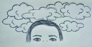
To follow along with the theme of identity while dealing with strong emotions, this piece was influenced by the idea of losing oneself and not knowing which path to take in life, so I titled the piece, "Confusion." There have been many events over the course of the past two years that left me unsure of where to turn. My parents had a sudden, unexpected divorce after a marriage of 16 years. My great grandmother who was loved so dearly, passed away. Worst of all, I was stalked and harassed by someone who I loved and cared about deeply. When the stalking began happening, I was so confused and scared. I did not understand why love could lead to an obsession that ended up murdering my relationship with this ex-boyfriend of mine, but it happened. Sometimes I wish it never did, though. Sometimes I wish that I could have experienced what that love could have felt like without all of the obsession. Would it have been different? Would we have lasted forever? Questions like these confused me. I knew that nothing could excuse the pain and fear that he forced upon me, but I cannot help but wonder how the events would have played out if he had made the error with someone else first.
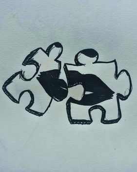
It seems wrong to forgive someone who caused me so much heartache, but the wise words of Charlotte Bronte in her novel, Jane Eyre, led me to the conclusion that forgiveness is all I can do since communication with him is restricted by a restraining order that I placed upon him. All the court dates, all the sleepless nights... all of it just to be forgiven. Bronte writes, "Would you not be happier if you tried to forget [his] every insult? To me, life is too short to be spent nursing in hatred. We are all burdened with faults in this world. But the time will soon come when we shall leave our earthly bodies, and only our spirits will remain... I hold a belief, which no one ever taught me, that makes Eternity a home, a place of rest. With this belief, I can forgive... Revenge never worried my heart - I live in calm, looking to the end" (Bronte 44). Before this year, all I wanted was revenge. He ruined my relationships with people, my reputation, and my life by his actions. I no longer wanted to live with this hatred that I harbored for him, so I forgave him silently. From this experience, I found my identity. I now knew the type of person I wanted to be. My mind was rid of the cloudiness from thoughts of revenge. It was clear that the path I chose after this terrible event was the right one. Others are not always that lucky. People turn to the influence of drugs and alcohol to find their meaning in life, without realizing that those pieces do not fit in their puzzle. To create this piece, I used the same methods as in "Depression." The photo reference for this piece had a more dumbfounded expression to symbolize the feelings of confusion. The eyes are wide open to show a shocked expression. The mouth is closed on the image because normally people who are confused do not know what to say. I also used less black to show that a clouded mind can be cleared and does not usually spread onto others the way depression or sadness might. |
|
Anxiety
Acrylic on canvas
October 2015
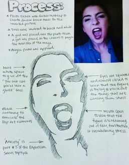
The third part of the triptych is titled Anxiety. The inspiration for this piece stemmed from pop art and German Expressionist artist, Kathe Kollwitz. With this piece, I incorporated less black because there really is not a sadness that spreads to others, but rather a worry that festers inside oneself. So, the black is more contained to show that the feelings are internal. The excessive white areas could symbolize the emptiness or worry that a person with anxiety feels. Normally when people get extremely terrified, their face gets paler and people say, "You look like you have seen a ghost." So in this painting, the white and black work together along with the screaming expression on the figure's face to create a sense of anxiety.
|
I titled the third piece in the expression series triptych, "Anxiety." This piece was my favorite to create because since I already created two other pieces similar to it, I was able to experiment more with brushstrokes and shading or lack thereof. Again, I used the grid method because it allows for more proportional work which tends to be a style of mine. The photo reference for this portrait had squinted eyes to emphasize that the figure wants to block out the events that are causing stress. The mouth is also open to show that the figure is attempting to scream out of pure frustration or overwhelming stress.
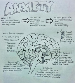
I chose anxiety as the main emotion for this piece because the majority of teenagers experience a great deal of stress throughout their high school years and during their transition to college life. Some people in society believe that being a teenager is easy, but I beg to differ. It is extremely difficult to maintain a high grade point average while still training for sports, participating in afterschool clubs, volunteering, attending dance practices, maintaining personal relationships, working eight-hour shifts, fulfilling sleeping requirements, and much more. Some teenagers might be able to handle it all easily, while others fall victim to unwanted stress. Anxiety is, by definition, the condition of feeling uneasy or worried about what may happen. It is recognized by the brain when the sounds and visuals that are recognized by the prefrontal cortex begin to send signals to the brain to show whether the body senses a danger. If it does, the amygdala is stimulated. This part of the brain is responsible for displaying strong emotions like fear or stress. The hippocampus, another part of the brain, functions as the memory center for the brain, reminding it about previous emotions that were connected to a specific event. When the situation arise again, it sends the information to the amygdala to initiate a fight or flight response in the body. This leads to symptoms such as restlessness, rapid heart rate, trembling, and shortness of breath. These symptoms intrigued me to research more to see how anxiety and depression could be reduced. So in the future, I plan to create a new series that focuses on the body parts that are affected from disorders or conditions like the ones that I focused on for my triptych. |
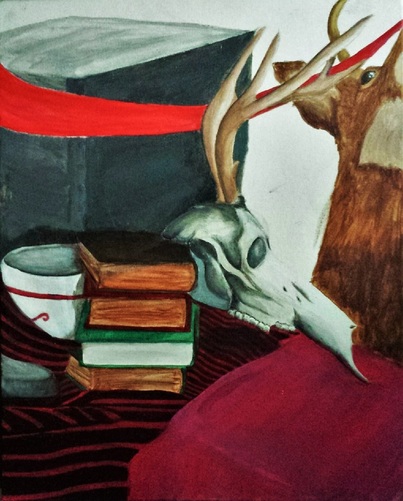
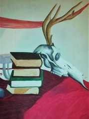
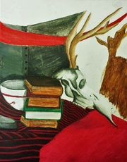
Still Life 1.0
Acrylic on canvas
December 2015
Though I experienced drawing a clothed model during the summer, I was not able to experiment with creating a still life piece. I have done still life pieces with pastel, charcoal, pen, and pencil before, but never with acrylic. I was inspired by the skull the most because I feel it captured the audience's attention really well. The vintage books also created an almost deathlike feel. All of these objects were once alive or used by live people and were now abandoned. I chose to use color to add some brightness to my senior work since so much of it was focused on emotions and self-identity.
|
This piece was inspired by a still life scene that was laid out on a table. I chose to paint this portion of the still life scene because I loved the arrangement. The way the skull was leaning against the old, vintage books intrigued my eye and urged me to explore the area in more detail. I noticed the patterns in the blanket that the books were on top of and the shadows on the china bowl that was slightly hidden behind the stack of books. The scene looked cluttered, but had enough open space and color that allowed it to feel balanced. The way the brightly colored ribbon cuts through the scene contrasted with the deep grays of the file cabinet that was positioned next to the table.
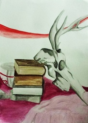
To prepare for this piece, I began by creating a watercolor sketch of the scene to layout the basic colors that I intended to use. In the watercolor sketch, I excluded the file cabinet and deer head. I feel like including them filled up the space a bit more, so I appreciate the choice I made as an artist. After the watercolor sketch, I sketched the shapes of the scene onto the canvas. I used the technique of having a burnt sienna undercoat so the tones blend more smoothly. I think this technique allowed me to have more success with the books especially. I thought it would give me problems when it came to the skull, but I think it improved my gradations greatly. I think I could have brightened up the painting more if I used brighter tones in the blankets to create a contrast with the dark tones of the deer head and file cabinet, since they are the darkest objects in the scene. If I used a hot pink tone, it could have created a nice-looking piece so I could rework those tones so they appear brighter. The skull was the most successful portion of this piece because of the gradations and proportion. |
|
