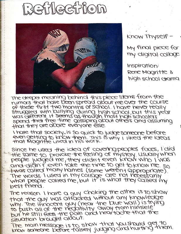
Suffocation
Digital manipulation
61cm x 91.5cm
August 2014
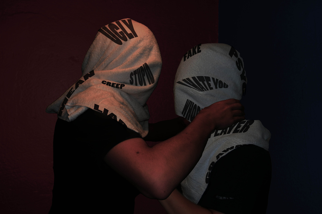
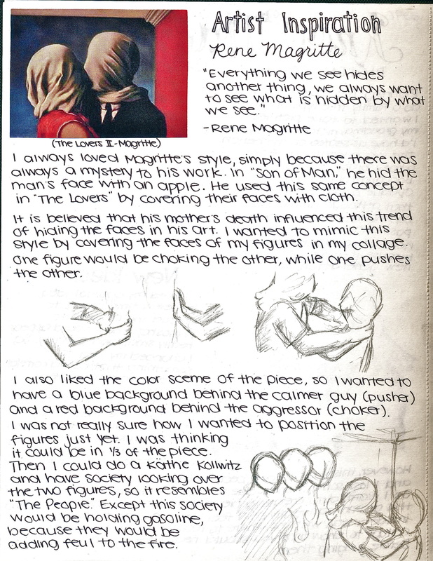
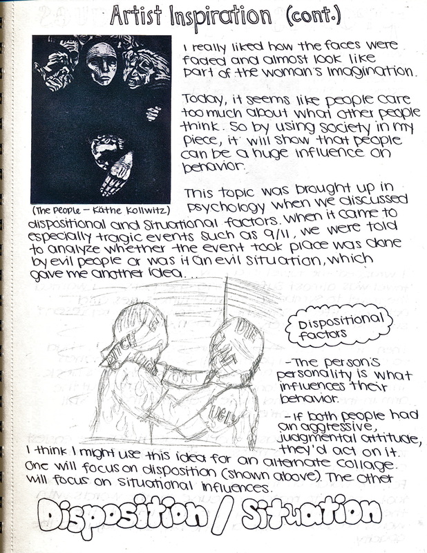
My inspiration stems from Rene Magritte and his idea that humans desire what is not visible. I took his painting The Lovers II and created an opposing feeling by having an aggressor attacking an innocent, usually calm person. I chose to do this because it helped me cope with a harassment situation that occurred during this time. I felt as though I was truly suffocating because no one heard my cries for help. I decided to have words stained onto the cloths wrapped around the two figures' heads to show how words can be detrimental to a person, too.
Visual Arts Journal - Digital Collage
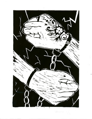
Well, Do I Have a Choice?
Ink on paper
22.85cm x 27.95cm
September 2014
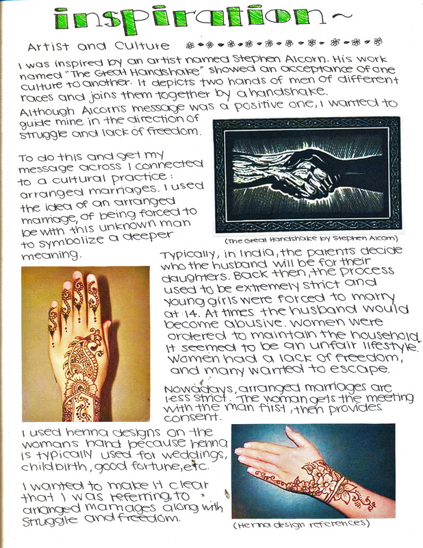
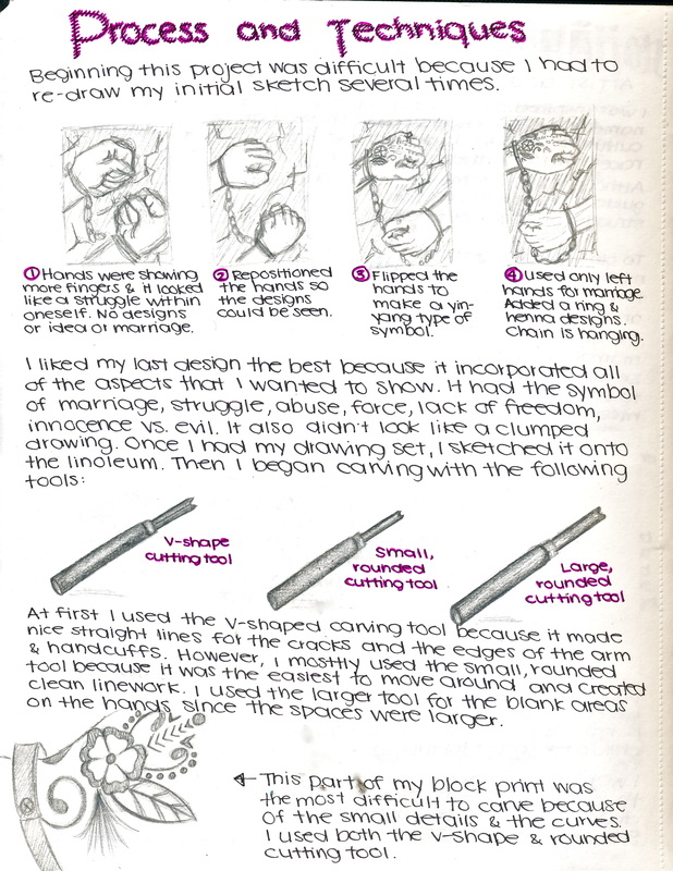
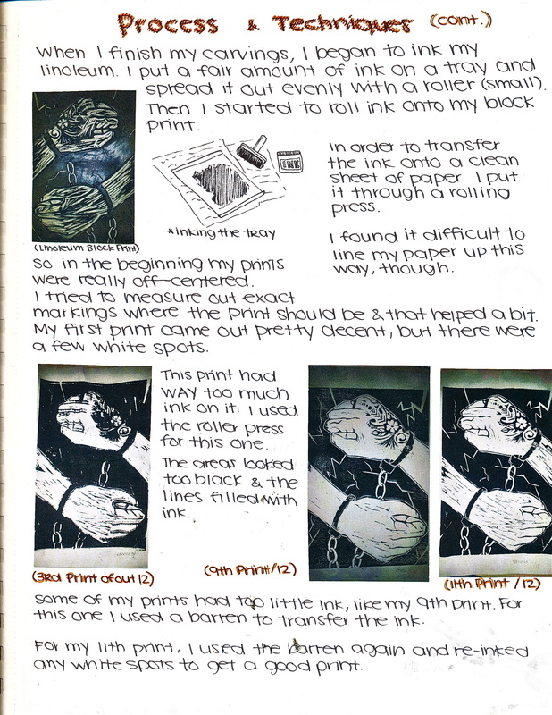
For this piece, I was inspired by both culture and an artist named Stephen Alcorn. He created a block print that he titled "The Great Handshake." The piece depicts two hands that seem to be from two people of different races. I think Alcorn was trying to show that differing cultures are more accepting of each other now. In my own piece, I wanted to explore the custom of arranged marriage, which is primarily seen in Indian cultures. For some families, it is an honorable and beautiful ceremony. For others, the child is unable to truly experience freedom. To show these two perspectives on arranged marriage I added cracks in the background (negative view) and henna on the woman's hand (the more beautiful, honored perspective).
Visual Arts Journal - Block Print
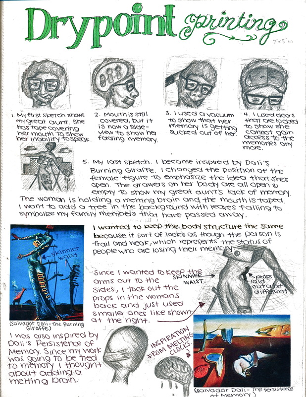
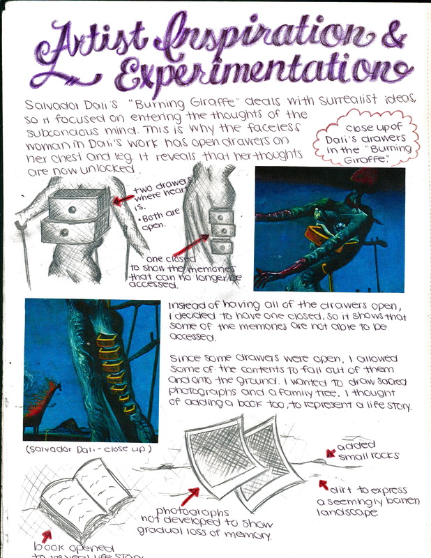
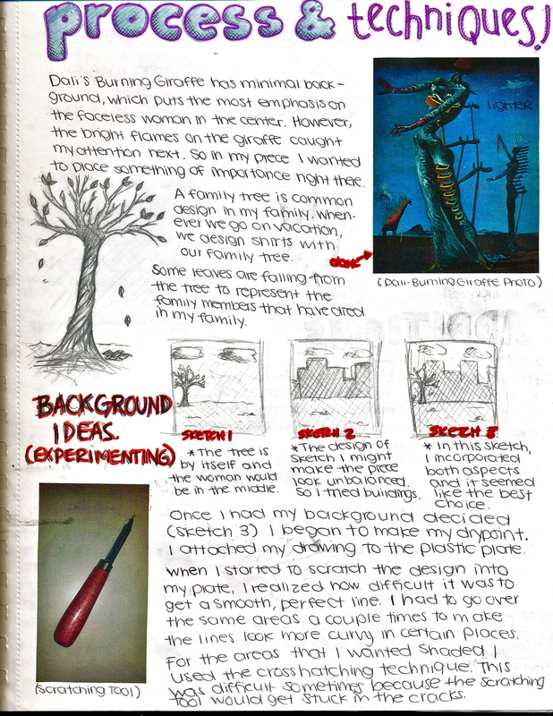
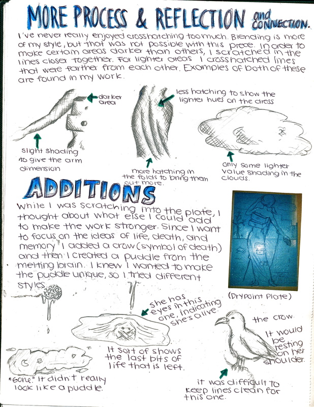
Memories Fade...
Ink on paper
22.85cm x 27.95cm
October 2014
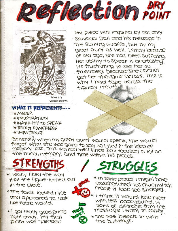
I was inspired by surrealist artist, Salvador Dali, for this piece. His painting "The Burning Giraffe" spoke to me because I felt like it dealt a lot with keeping things secret, and letting those secrets burn you alive. So I took a slightly different approach by incorporating memory into the mix. My great aunt is in a nursing home right now because she can no longer take care of herself. Her speech and memory are also suffering. The main figure is squeezing a brain in one hand to sort of show the frustration that my aunt feels when dealing with this memory loss and speech difficulties. The speech problems are also emphasized in my piece by having pieces of tape covering the figure's mouth. All of the drawers on the figure are open to show that all of her secrets and memories are now exposed to the world, since she is in such a vulnerable state.
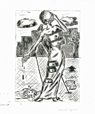
Visual Arts Journal - Drypoint Printing
Broken Vows
Mixed media; block print, photos, portraits, book pages, nails, chains, toothpicks, sticks, mirror and glass fragments
30.48cm x 30.48cm x 30.48cm
November 2014
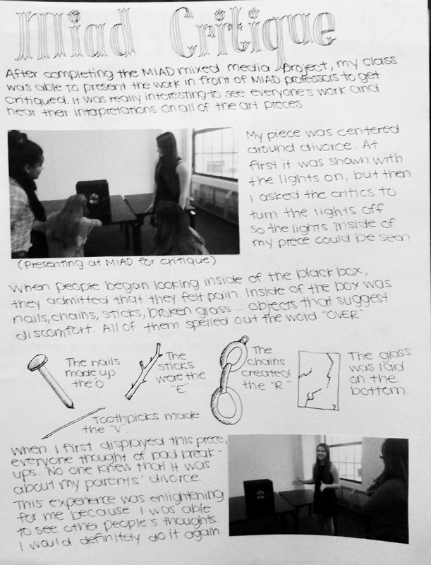
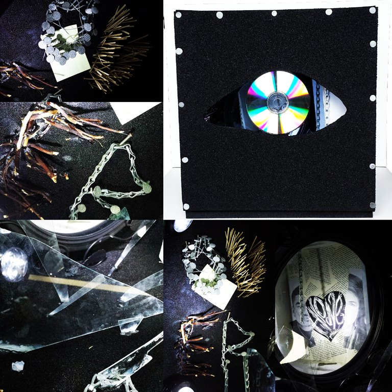
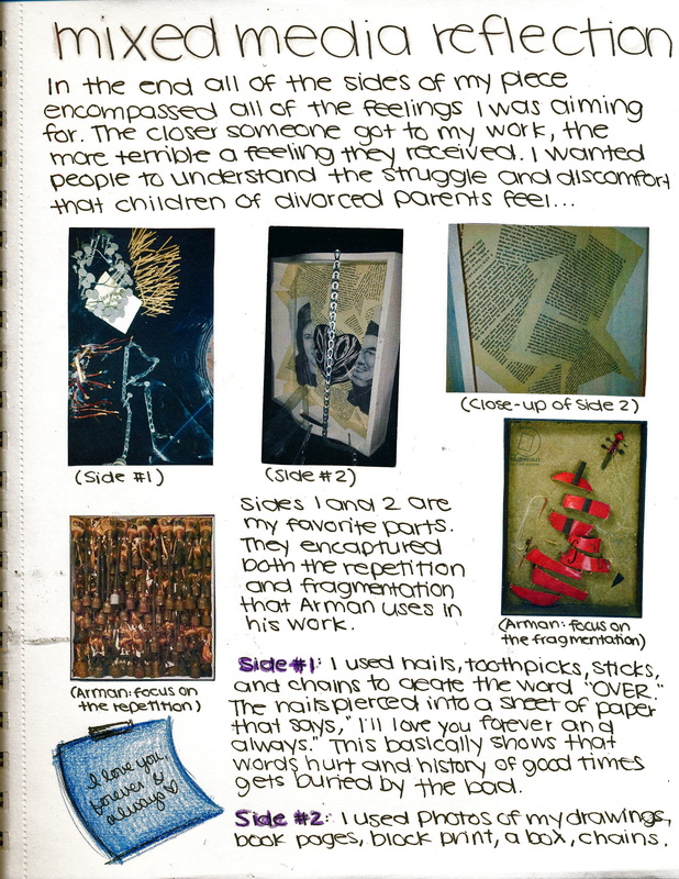
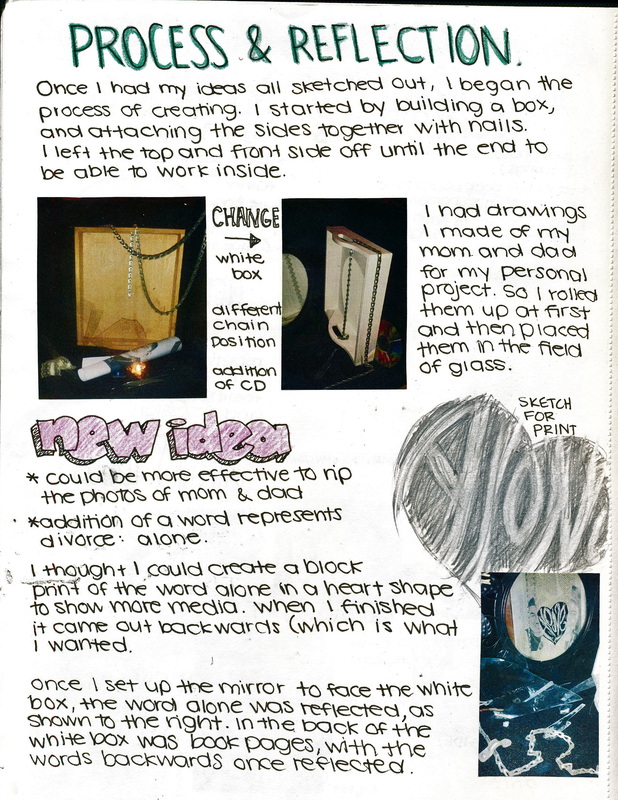
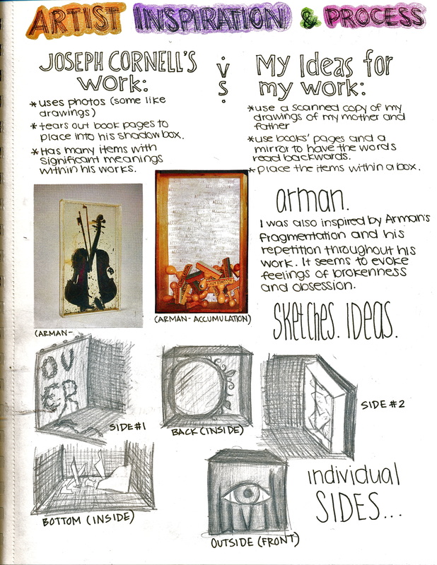
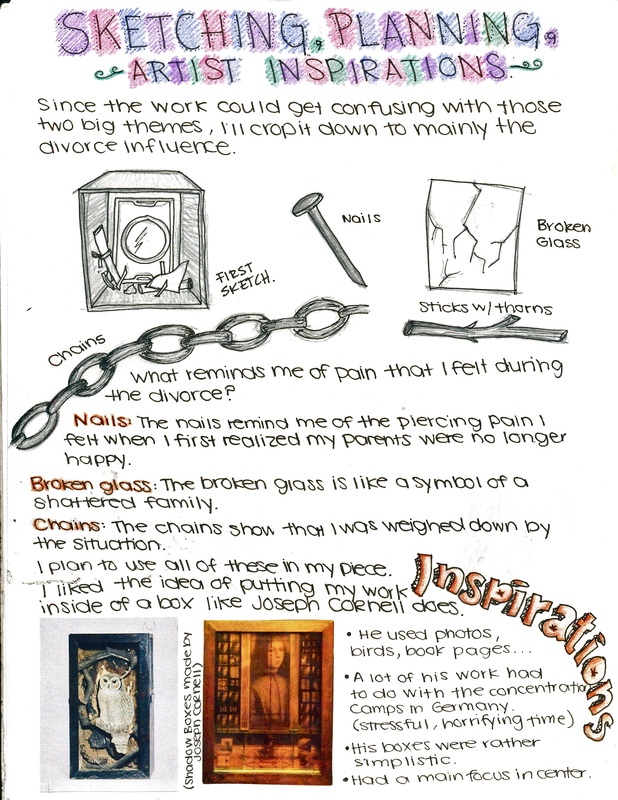
This piece was inspired by Joseph Cornell's shadow boxes. I loved how he was able to incorporate several different objects into his boxes to evoke a certain emotion. In my work, I wanted to express a painful emotion because the work served more as a coping mechanism for my parents' divorce more than anything else. I formed a black box out of foam boards and began to set up an arrangement of nails, toothpicks, chains, and sticks to create the word "OVER" to signify the end of my parents' relationship. Right when you peer inside the box, large fragments of broken glass appear before your eyes, and behind them are portraits that I drew of my parents, ripped in half. All of these items are so clustered together that a feeling of pain and even a sort of claustrophobia overwhelms you as you try to take it all in. I titled this piece "Broken Vows" because I felt it tied into the idea of a failed relationship, which I'm sure most people can relate to whether they were in one themselves or witnessed one.
Process portfolio - Mixed media
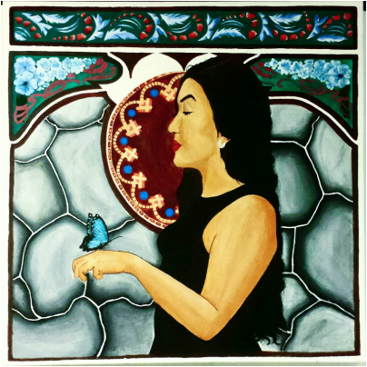
Mariposa
Acrylic on canvas
91.44cm x 91.44cm
December 2014
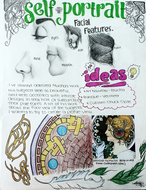
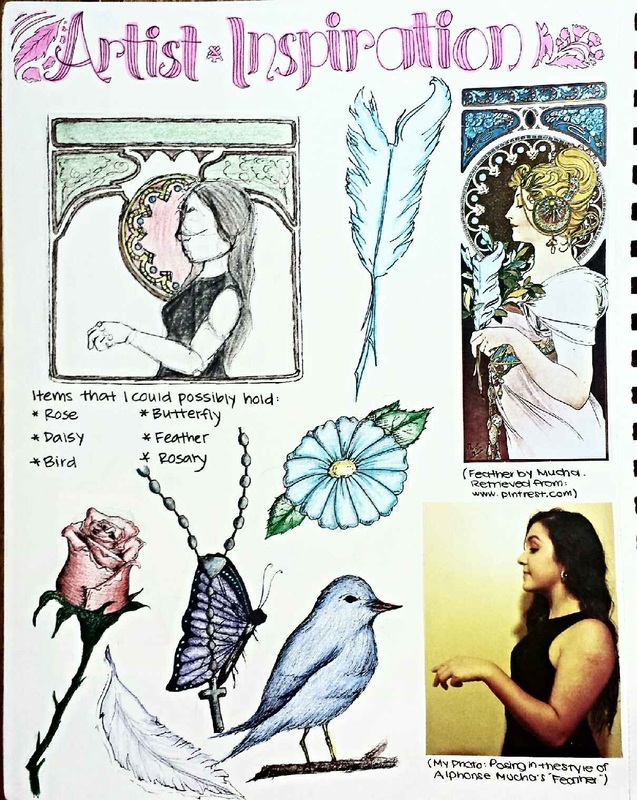
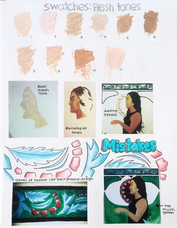
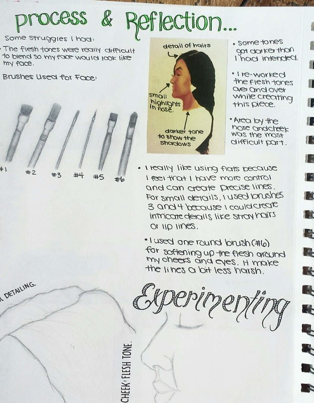
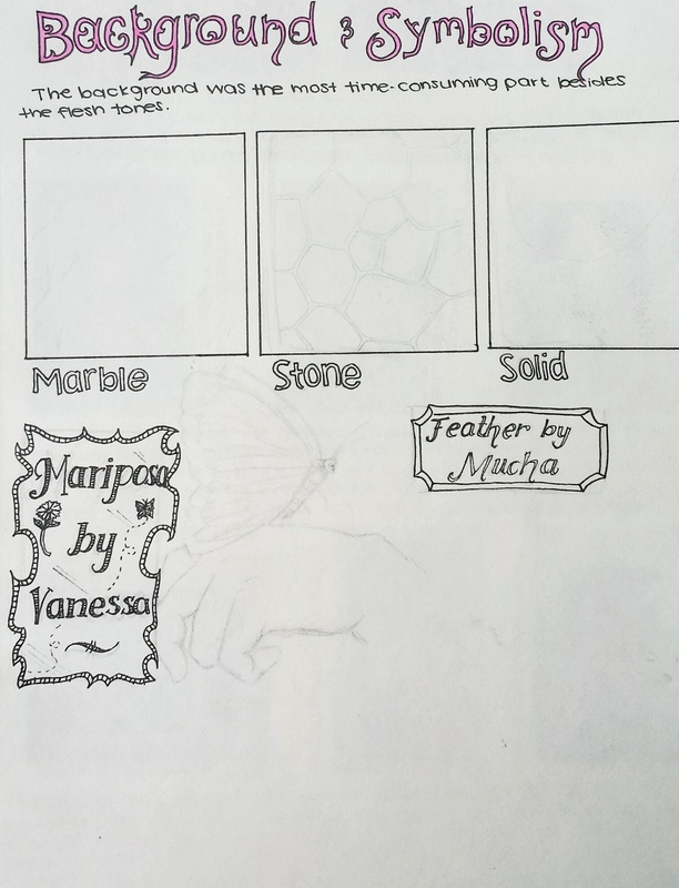
For my self portrait, I desired to emulate the style of Alphonse Mucha. He inspired me with his delicate line work, beautiful flower-like arrangements, and flawless women. I loved his painting "Feather" which is usually paired with the more popular "Primivere." I thought it would be interesting to take a different approach than most of my fellow peers by doing a side-view of myself, just as what is seen in "Feather." I used a design pattern for the top of my canvas that was similar to Mucha's. The background was very different though, because I did not like the tan color that was in his work, so I decided to add in a marble-like texture at first. Then, after realizing how difficult it was to create a marble texture, I attempted to use stones, which I think turned out very well.
Process portfolio - Self portrait
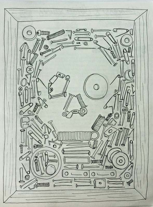
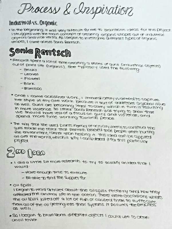
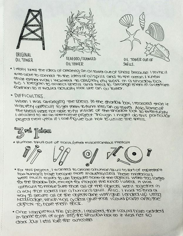
Industrialize Me
Mixed media; nails, pins, bolts, metal plates, screws, staples, shadow box, sand
January 2015
For this piece, I wanted to show how our world, including humans, has become industrialized. Everything that surrounds us has been advancing much more quickly ever since industry was born. Now, people are able to communicate more efficiently, have sturdier shelters, accomplish tasks at a faster pace, etc. All of this is possible because of industrialization and technological advancements. We are constantly putting nature, or the organic aspects of the world, behind us and trusting technology instead. I believe that this dependence can be detrimental in the future so I wanted to capture how humans are beginning to think industrially by creating a skull out of industrial materials.
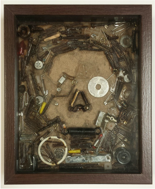
Process portfolio - Organic vs Industrial
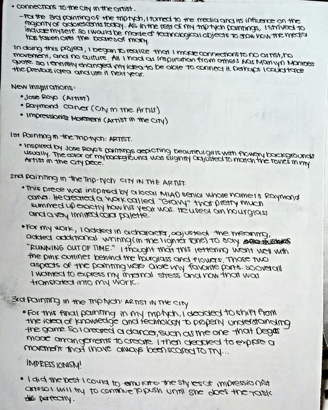
Artist, Artist in the City, City in the Artist
Acrylic on canvas
60.96cm x 91.44cm (Each individual canvas is 60.96cm x 30.48cm)
February 2015
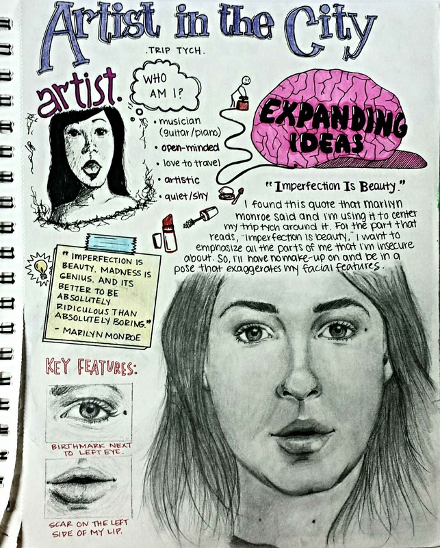
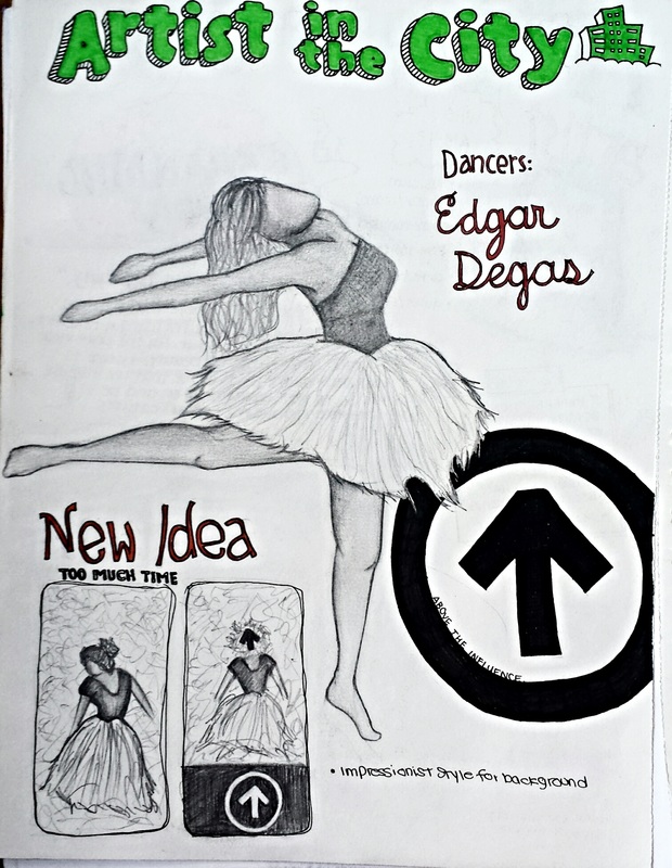
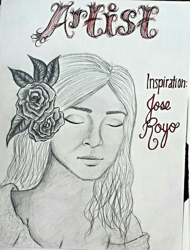
For this piece, I originally was inspired by one of Marilyn Monroe's quotes, but I felt that there was not a large enough connection to my work and her quote so I decided to take an alternative route with this. For the Artist portion of this triptych, I used Jose Royo as inspiration because I loved how beautiful he made women appear, and his painting technique was very different from mine so I had to try to be a little more abstract. For the Artist in the City, I was inspired by a local artist from MIAD named Raymond Carver. Our pieces had similarities in regards to the hourglass and flowers. Mine had a contrasting meaning in comparison to his, though, especially since I added the phrase "Running out of time." Lastly, my third piece was the most difficult. I had always tried to avoid impressionism in my work because I was afraid of the difficulty and what the outcome might be. But in this piece, I think I was able to do fairly well in creating the right tones and effect.
Visual Arts Journal - Artist in the City
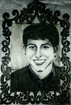
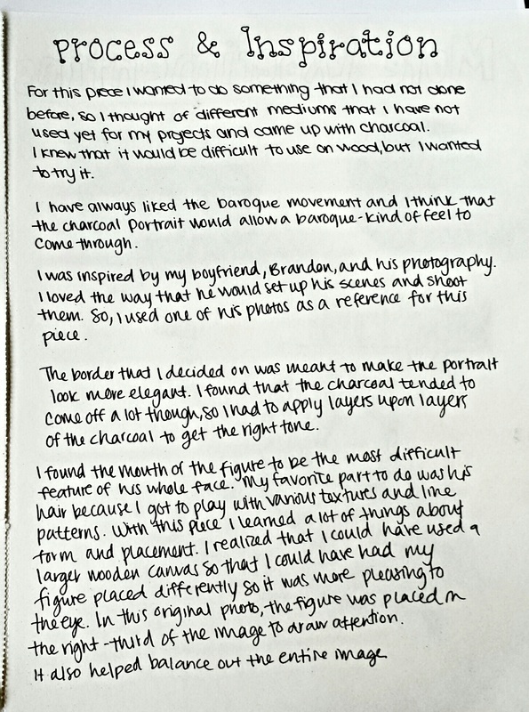
Brandon
Charcoal on wood
March 2015
This piece was inspired mainly by my boyfriend's photography. I loved the way that he set up his scenes and shot them, because he had a great idea of balance and placement so the photos were visually appealing. I used one of his photos as a reference for this portrait of him.